CHAPTER 20 |
Advanced Layout |
This chapter describes some techniques that can be used to achieve more complicated widget layouts.
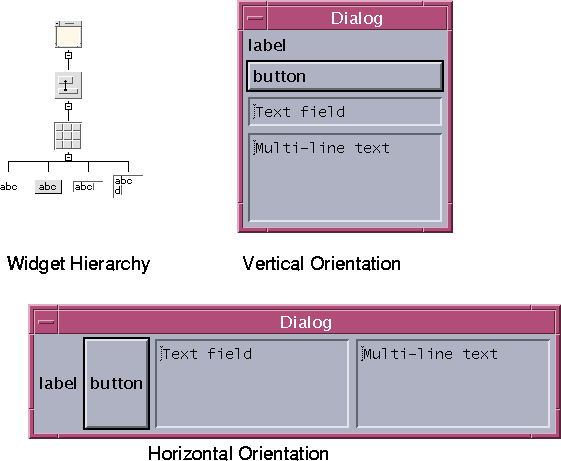
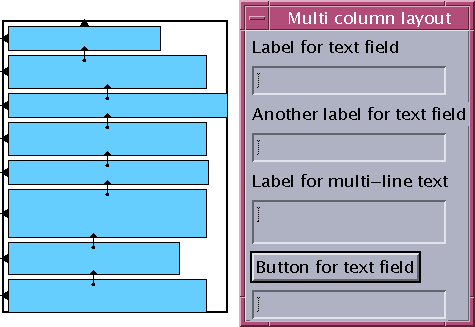
Dialog elements are frequently arranged in a column or row. This is easy when only a single column is needed but requires more work to create multiple columns.The easiest way to create a single column layout is to use a RowColumn widget instead of a Form. The RowColumn can take almost any widget as a child and different widget types can be children of the same RowColumn. If the orientation of the RowColumn is vertical, it produces a single column; if horizontal, it produces a single row. These results are shown in Figure 20-1.
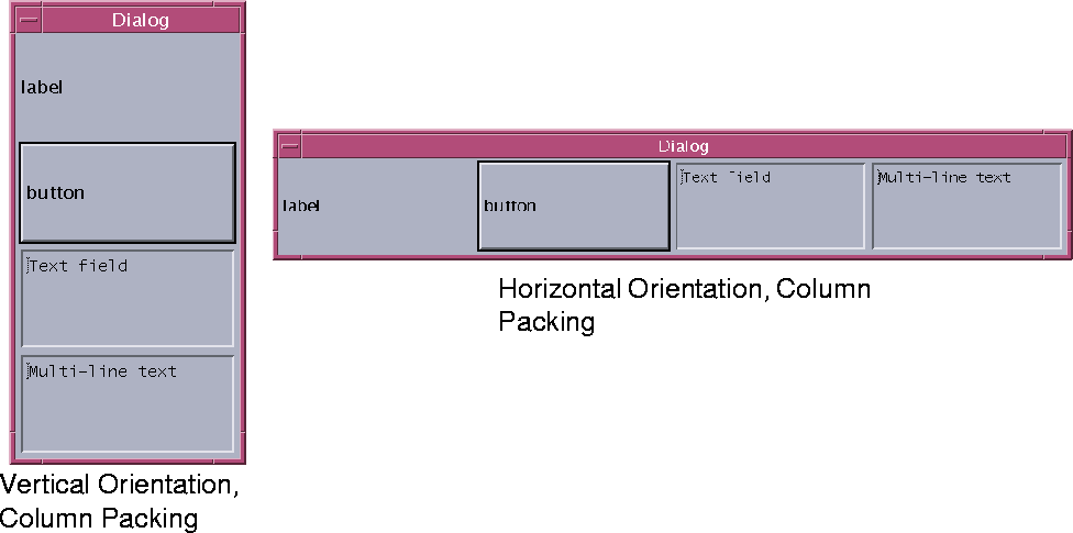
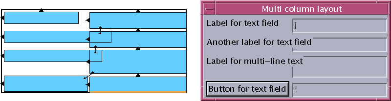
Figure 20-1 shows the default behavior of the RowColumn widget when the Packing resource is set to "Tight". "Tight" packing produces exactly one column or row. In the column layout, all widgets are constrained to the same width but they can have different heights; in the row layout, all widgets are constrained to the same height but they can have different widths.If you set Packing to "Column", both the width and height of all widgets are the same, as shown in Figure 20-2.
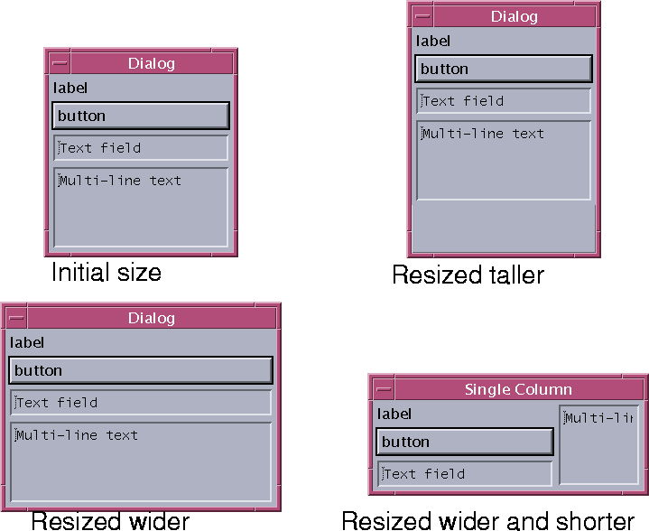
Since any dialog can be potentially resized, the behavior of its components upon resizing is always important. There is no general documentation of resize behavior; you have to discover it by experimentation. A vertical RowColumn with "Tight" packing behaves as shown in Figure 20-3.
All children in a RowColumn widget are displayed if at all possible. If the RowColumn is not large enough to display all of its children, the ones that don't fit are not displayed at all. It is rare to see only part of a child widget.
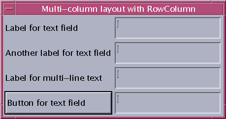
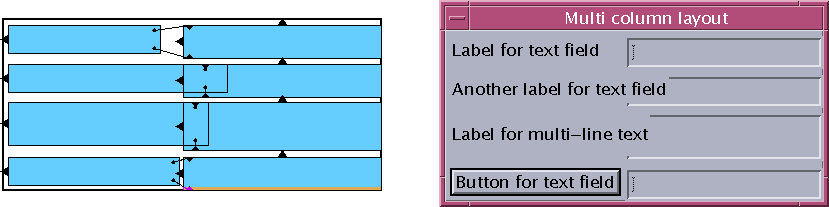
You can use the RowColumn widget to lay out widgets in multiple columns, as shown in Figure 20-4.
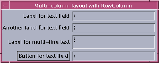
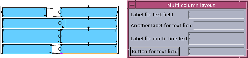
This layout has limitations, however. In order to get more than one column, you must set Packing to "Column", which forces all of the children to be the same size. In this case, because one of the text boxes is 2 lines high, all of the text boxes must be that size. The result wastes space and may be confusing to the user. The layout shown in Figure 20-5 is an improvement:
This layout cannot be achieved with a RowColumn because some of the rows are not all the same height. However, it can be achieved with a Form.
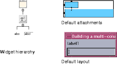
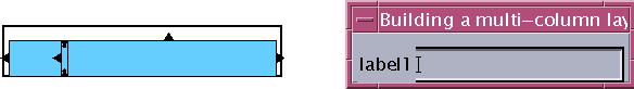
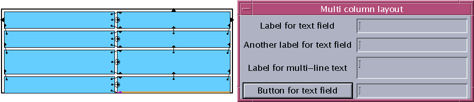
The following section presents a systematic approach to creating complex column layouts. The first example is a two-column layout with a single row containing one Label and one TextField widget. Note that, unless otherwise noted, the value of all attachment offsets in this chapter is zero.When you first create the Form and add its children, Motif arranges the children down the left side of the Form by attaching the left side of each widget to the left side of the Form. The top of the first widget is attached to the top of the Form and the top of each successive widget is attached to the bottom of the one above it. Therefore, if you create a Form containing a Label and TextField, you get the layout shown in Figure 20-6.
The Form used in this example has horizontal and vertical spacing set to 5 pixels.
Figures 20-7 to 20-11 illustrate how to start shaping this arrangement into a two-column layout.First, move the TextField to its approximate position as in Figure 20-7.
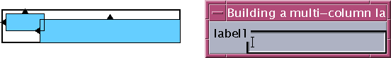
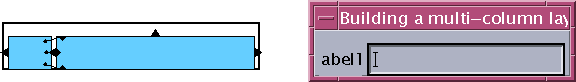
Next, align the top and bottom of the Label with the top and bottom of the TextField as shown in Figure 20-8.
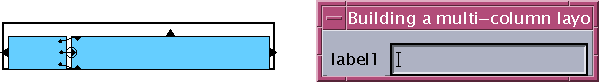
Attach the top and right side of the TextField to the top and right side of the Form, as shown in Figure 20-9.
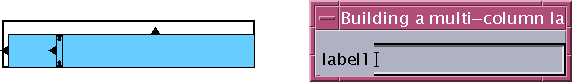
Attach the right side of the Label to the left side of the TextField, as shown in Figure 20-10.
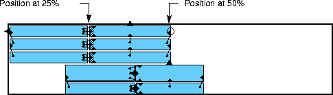
Finally, set the position of the left side of the TextField at 25%, as shown in Figure 20-11.
It may seem strange to fix the left side of the TextField by setting its position, while the right side of the Label is attached to the left side of the TextField. While it might seem more natural to fix the left side of the TextField by attaching it to the right side of the Label, this creates a circular attachment and the Form does not allow it. The 25% value used for the position is arbitrary at this stage. You cannot choose the final position until you know the widths of all the widgets, at least approximately.
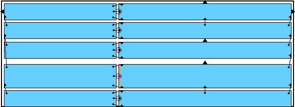
It is easy to extend this procedure to multiple rows - just repeat the same steps. The only difference is that in the first row the extreme left and right positions (the left side of the Label and the right side of the TextField) are set by attaching them to the sides of the Form. For each subsequent row, however, these positions are set by aligning the widgets with the row above.
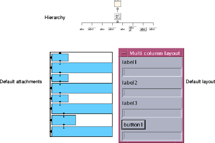
Figure 20-12 shows the initial state of the dialog shown in Figure 20-5. In that dialog, the left column consist of three Labels and a PushButton while the right column contains three TextFields and a Text widget.You can begin by setting the resources on the widgets that make up the dialog: the label text for the Labels and Pushbutton and the number of rows and edit mode of the multi-line Text widget.
It is not necessary to set these resources at this time; you can set them later if you prefer. However, setting them at this stage gives you an early impression of how the dialog will look and whether or not it is likely to work as you expect.
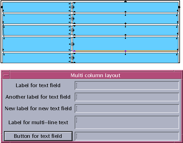
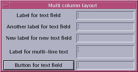
Set the resources to produce the layout shown in Figure 20-13.
Now you can apply the procedure illustrated in Figures 20-7 to 20-11 for each row of the column. The first step is to move the Text and TextField widgets to their approximate positions, as shown in Figure 20-14.
Next, align the top and bottom of the Labels and PushButton to the top and bottom of the corresponding Text or TextField widget as shown in Figure 20-15.
As in Figure 20-9, you can now attach the TextField widget in the first row to the top and right sides of the Form using an offset of 5 pixels. Attach the top of each other TextField and Text widget to the bottom of the one above using an offset of 5 pixels.Next, align the Text widgets with the top one. For the right sides, align the right side of each Text widget with the right side of the one above (or attach using an offset of 0 pixels). Alternatively, use "Group Align", selecting the Text widgets from bottom to top. For the left sides, set positions to an arbitrary value such as 50%.
At this stage, align the left side of each Label and the PushButton with the left side of the widget above. Again, you can use "Group Align", selecting the widgets from bottom to top. The layout should now resemble the one shown in Figure 20-16.
Attach the right side of each Label and the PushButton to the left side of the corresponding Text or TextField widget as shown in Figure 20-17.
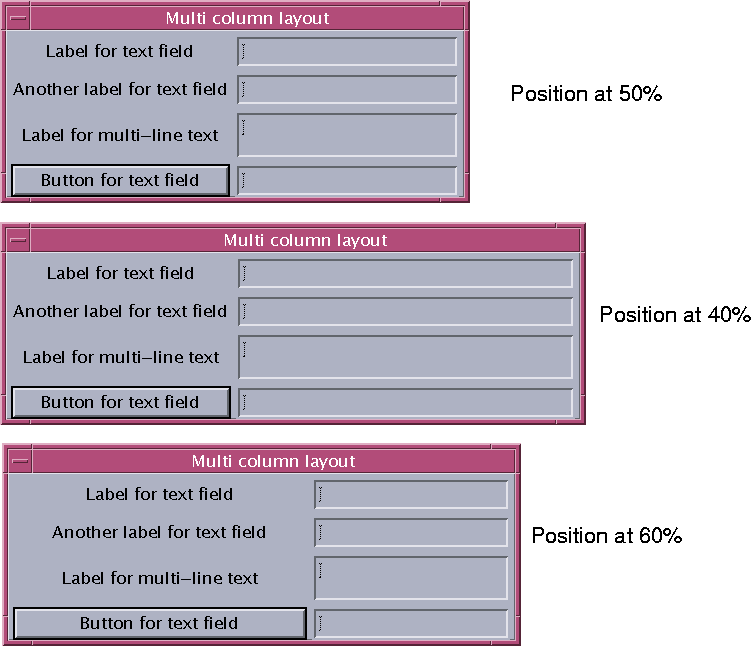
The final step is to adjust the position of the left side of the text widgets. This may require some trial and error. If the percentage is too high or too low, the Form is wider than necessary and wastes screen space. Some examples are shown in Figure 20-18.
Note that when you experiment with different position values, the Form may grow each time you change it (depending upon the value of the resize policy resource). This is because the Form is not too clever about constraints which change after the Form has been created. Reset the Form to see how it will really look in your application.While the arrangement of attachments, alignments and positions used for the multiple column layout may seem complex, it is flexible and adaptable. In particular, it is relatively easy to add a new row to the dialog.
Adding a new row at the bottom of the dialog is easy; just add the new widgets to the design and set up the attachments as in the row above. Adding a new row in the middle of the dialog, however, is less straightforward.
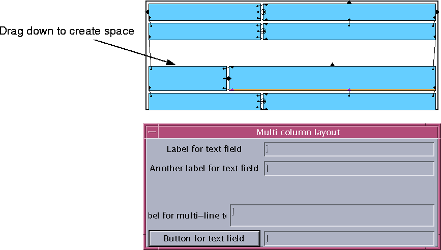
The first step is to open a space for the new row. Because each row is only attached to the one above, and because the widget in the left column is attached at the top and bottom to the widget in the right column, you can move the whole bottom portion of the dialog down just by dragging the widget in the right column. This breaks all of its attachments to other widgets and you must remake them later. However, attachments from other widgets to the widget are unaffected. Figure 20-19 shows the effect of pulling down the Text widget.
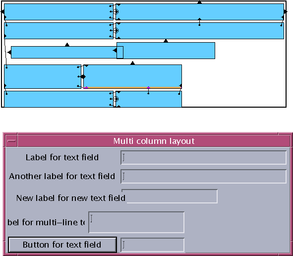
Now you can add the widgets for the new row, set their resources as required and move them to their approximate positions as shown in Figure 20-20.
The next step is to align the widgets in the two columns as in Figure 20-21.
Finally, attach each Text or TextField to the one above it and set the positions of the left sides of the Text or TextField widgets as in Figure 20-22.
As the new Label is a little too narrow, set the position of the left sides of the text widgets to 55% and reset the dialog to produce the result shown in Figure 20-23.
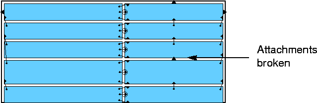
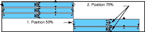
Dialogs containing two columns, at least in part, are common. If there are so many items that a two-column layout becomes too tall, you can change it to a four-column layout.For example, you can move the fourth and fifth rows of the example above into a new pair of columns, 3 and 4. The first step is to break the attachments, shown in Figure 20-24, that keep these rows aligned with the rows above.
Next you need to make room for two new columns on the right. This is done by setting positions on the first three rows which approximate the attachments they will have in the final Form. Figure 20-25 shows the result. When you change the positions, the Form becomes very wide and so you should reset the Form after changing the positions.
Likewise, set approximate positions on the bottom two rows as shown in Figure 20-26. You must set the positions in the order shown to avoid temporarily putting the Form in a inconsistent state. If you do things in the wrong order, you get the message "Bailed out of edge synchronization". While you can safely ignore this error message, you must dismiss the message box before continuing. Remember to reset the Form after changing the positions.
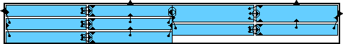
You can now move the right pair of columns up to their correct position by attaching the top Text widget to the top and right sides of the Form. This produces the result shown in Figure 20-27.
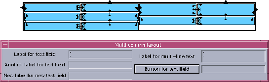
The layout is almost finished. The right side of column 2 is currently positioned at 50%. Replace this position with an attachment to the left side of column 3, which is also positioned at 50%. Figure 20-28 shows the final layout.
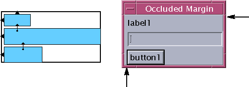
A Form that is a child of a Shell draws a margin line round its inside edge. Any child widget of the Form that extends exactly to the edge of the Form occludes part of this margin line (Figure 20-29).
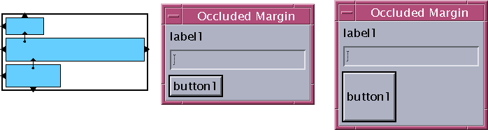
The simplest way to deal with this is to attach any widgets that overlap the margin to the sides of the Form with a small offset to reveal the margin. However, this can also produce undesirable resize behavior, as shown in Figure 20-30.
There are two other possible approaches to solving this problem, both of which involve introducing extra widgets into the design.
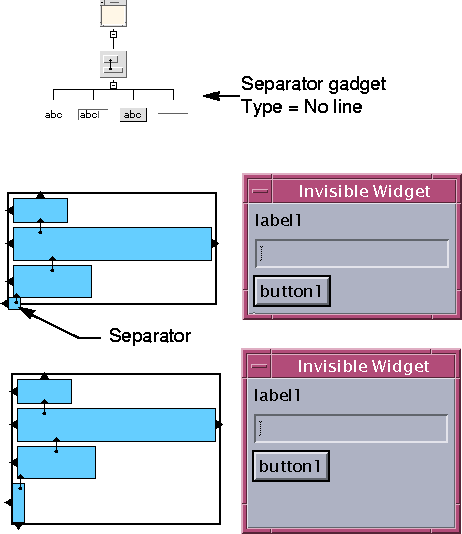
The problem with the simple attachment in Figure 20-30 is that the button resizes when the Form does and it looks strange. An alternative is to introduce an extra, invisible widget. Although this also resizes with the Form, it does not look strange because it is invisible. A Separator gadget with the Type resource set to "No Line" is most effective. Figure 20-31 shows the widget hierarchy and attachments after adding an invisible widget to the previous example.
The bottom of the Separator is attached to the bottom of the Form by a small offset to prevent it from hiding the margin line. The top of the Separator is attached to the bottom of the PushButton with zero offset. The Separator now resizes vertically with the Form but the other components do not.Note that the Form Layout Editor exaggerates the height and width of the Separator (and any other widgets under a certain size) to allow you to set its attachments using the mouse. Although this makes it look as if it is occluding the margin in the bottom left corner, in fact it is not.
You could also use a second Separator to keep the right side of the TextField widget inset from occluding the right edge of the Form (or even use the same Separator for both jobs). However, the horizontal resize behavior with the attachments shown in Figure 20-30 is appropriate for most purposes (the TextField widget resizes horizontally with the Form).
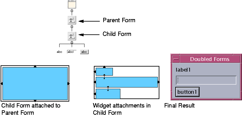
Another technique is to use a second Form as the invisible widget. This works because the Form only draws its margin line if it is the immediate child of a Shell. The intermediate Form, which is not a child of the Shell, does not draw a visible margin line and so its children can extend all the way to its edges without causing occlusion problems. Using an intermediate Form protects against margin occlusion on all four sides.Figure 20-32 shows the widget hierarchy and appropriate attachments for this technique. The child Form is attached at all four sides to the parent Form with a small offset to make the margins visible.
As an alternative to the parent Form, you can use a BulletinBoard, setting the margin width and height to a relatively small value such as 5 pixels. Because the Shell assumes that its child is a BulletinBoard (or a BulletinBoard derivative such as a Form), you should not use a different kind of container widget (such as a Frame) in this position.
What happens when the user resizes a Form depends on how the attachments and positions are set up. In general, you should try to design every dialog so that if the user makes it bigger, more of the important information is displayed. For example, if a dialog contains a scrolling list, the user should be able to make the visible portion of the list longer by making the window taller. On the other hand, there is no reason to make widgets such as Labels and buttons grow with the window, since this conveys no additional information.In practice, any Form layout must probably compromise between resize behavior, robust response to size changes within the widget (such as font changes), ease of implementation and ease of maintenance. This section offers some basic guidelines for creating Forms with desirable resize behavior.
A widget in a Form grows wider when the Form does only if it has constraints on both right and left edges; it grows taller with the Form only if it has constraints on both top and bottom.The most straightforward way to lay out a dialog is to work from the top left corner towards the bottom right corner of the Form, attaching the top and left of each widget to the bottom and right of a previous widget. If you do this, none of the widgets resize with the Form. To make the widgets in a Form resize sensibly, you must be a little more sophisticated.
You have already seen an example of horizontal resizing using the RowColumn widget in "Resize Behavior of RowColumns" on page 575. The rest of this chapter demonstrates some additional techniques.
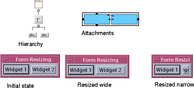
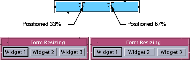
Layouts with only two widgets across the width of the Form are relatively simple. You only need to decide whether the extra width that results when the Form is resized is given to one widget or the other, or shared between the two.Figure 20-33 shows one alternative. Widget 1 is attached to the Form at its left side but its right side is unconstrained; therefore, it finds its own natural width, wide enough to display the text label. Widget 2 is attached to Widget 1 on the left and to the Form on the right; therefore, its size varies to fill the part of the Form width that is not occupied by Widget 1. In other words, Widget 2 gets all the extra space.
When you reset the Form, it sets its own width to accommodate both widgets, producing the initial state shown in Figure 20-33.
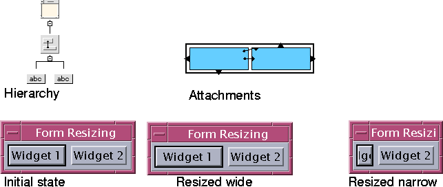
The attachments between the two widgets are reversed in Figure 20-34, i.e. the right side of Widget 1 is attached to the left side of Widget 2 instead of the other way around. The result is that Widget 2 stays the same size and Widget 1 gets all the extra space.
You can reverse a right-to-left attachment between two widgets simply by adding a new left-to-right attachment in the same place. The Layout Editor detects this situation when you add the new attachment and removes the old attachment. However, in the example just given, you will see a circularity error message when you do this because there are two attachments to be changed. To get rid of the circular attachment, you must also swap the attachment that aligns the tops of the two widgets. Since both widgets have the same height, this does not affect the appearance of your layout.
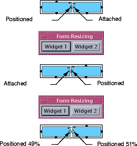
If you want to share the extra space equally between the two widgets, you must use proportional positioning. You can set a position on Widget 1 and attach Widget 2 to it or set a position on Widget 2 and attach Widget 1 to it, or set positions on both. Any of these methods works as long as you avoid circular attachments. Figure 20-35 shows the three possibilities.
In Figure 20-35, the positions are set at about 50% and the two widgets share the width of the Form about equally. You can use different percentages to favor one widget or the other. In this example, the extra space is shared in proportion to the initial sizes of the widgets. The initial state and behavior of the form when resized narrow is the same in all cases.
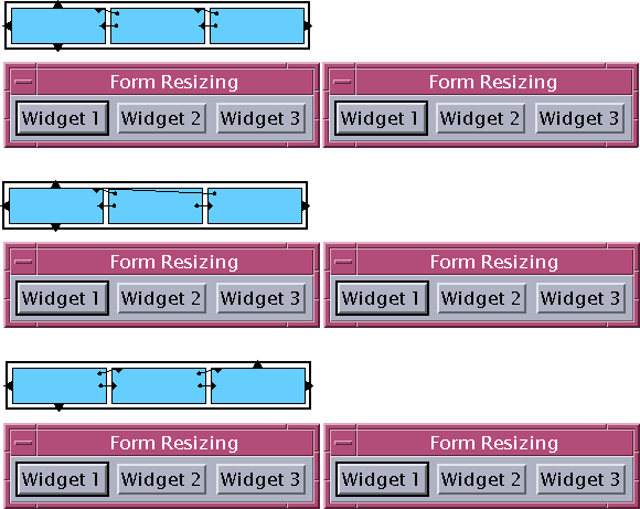
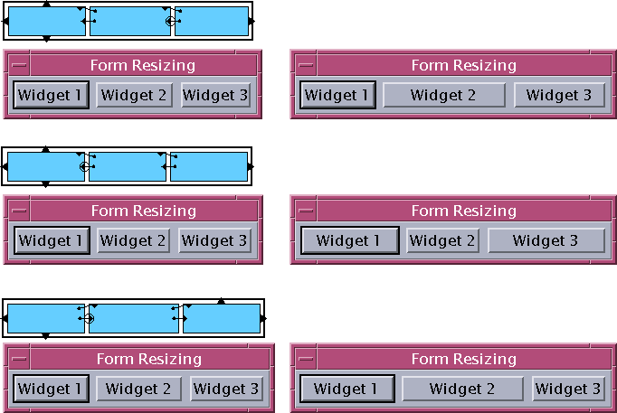
With three widgets, there are more possibilities. The extra space can be given to any one of the three, or shared among them. Figure 20-36 shows the simple cases, where all the extra width goes to one of the three widgets. Notice that in every case the widget with attachments or position settings at both ends is the one that resizes with the Form.
To share the space among all three widgets, you can use simple proportional positioning, as shown in Figure 20-37.
As with two widgets, you can use different percentages to favor one widget over another.You can use combinations of attachments and positions to create layouts where one widget does not resize but the other two do. Figure 20-38 shows some examples.
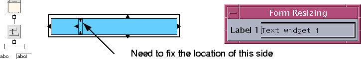
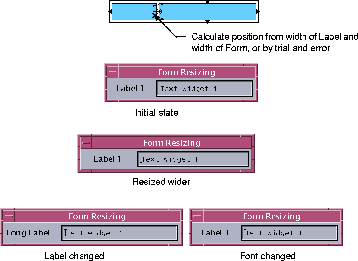
In all the examples so far, the widgets that share the width of the Form are all the same height. This gives you considerable freedom in arranging the attachments on the tops and bottoms of the widgets and lets you avoid circular attachments easily. If the widgets are of different heights, however, this is not so easy.With a hierarchy like the one shown in Figure 20-39, you want a layout where the Text widget on the right makes maximum use of the available space, similar to the right-dominant layout in Figure 20-33. However, this requires attaching the widget on the right to the one on the left. You cannot do this in the example shown in Figure 20-39, because the Label widget on the left is already attached at the top and bottom to the Text widget to produce the correct vertical alignment.
There are three ways to solve this dilemma:
| 1. | Attach the left side of the Text widget to the left side of the Form using an offset large enough so that the Text widget does not obscure the Label. Attach the right side of the Label to the left side of the Text widget as shown in Figure 20-40. |
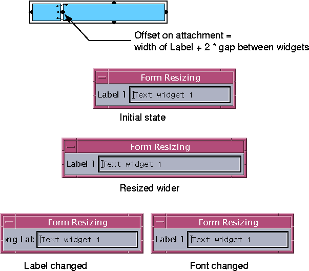
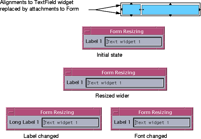
| 2. | Position the left side of the Text widget at a given percentage and attach the right side of the Label to it as shown in Figure 20-41. |
| 3. | If there is only a single row, the alignments at top and bottom of the Label can be replaced with attachments to the Form and the left side of the Text widget can then be attached to the right side of the Label as shown in Figure 20-42. |
The figures show these three approaches and their behavior when the Form resizes, the label changes and a font changes. Variations on these approaches display similar behavior.In Figure 20-40 the Text widget is attached to the Form at both ends. The virtue of this layout is that the Text widget gets all the extra space that results if the Form is resized wider. However, it is only satisfactory if the user is not likely to change the application's configuration extensively; it does not behave well if the label or the font changes.
In Figure 20-41, the left side of the Text widget is positioned. This is a more robust layout if the label or font changes as the label takes a share of any extra Form width. This is generally the most useful approach, especially for column layouts, as previously discussed.
In Figure 20-42 the problem with circular attachments is removed by attaching the top and bottom of the label to the Form, instead of aligning them with the top and bottom of the Text widget. You can then attach the left side of the Text widget to the right side of the Label, producing a right-dominant layout similar to that used in Figure 20-33.
This solution exhibits the best behavior. However, you cannot use it for column layouts, since each row must be enclosed in a separate Form and there is then no way to align the columns vertically. It also requires an extra Form widget for each row, which can create significant overhead.
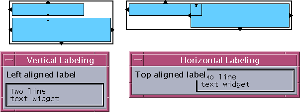
The solutions for vertical resizing are essentially the same as for horizontal resizing. However, there are usually fewer problems with circular attachments. This is because a label positioned above an object can usually be aligned with the left edge of the object, while a label to the left of an object may need to be centered in the available space. Figure 20-43 illustrates this.
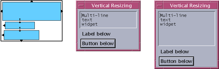
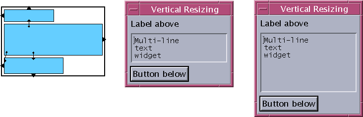
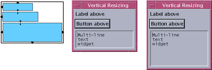
Figures 20-44 to 20-46 show examples of vertical layouts similar to the horizontal arrangements in Figure 20-36. In each case, any extra height is given to the multi-line Text widget.
The initial size of a dialog is determined by a process of negotiation between the Shell, the Form and the widgets within the Form. Normally the Form tries to find a layout that satisfies all the constraints on its children and lets each be at least as large as it wants to be, which is at least the "natural" size. The Form then sizes itself to contain this layout and the Shell sizes itself to contain the Form.Most widgets have a sensible natural size. Labels, for example, have a natural size determined by the text content of the label and the font; Text widgets normally size themselves according to the number of rows and columns specified by their resources.
If your dialog only contains widgets that have an acceptable natural size, you can let the Form work out the initial size for you. Problems only arise when the dialog contains widgets that do not have an acceptable natural size. You must then fix their size with constraints, which may make the initial size of the dialog seem too small.
If you have this problem, set the initial size of the dialog by setting the width and height resources of the top level Form or BulletinBoard. You cannot set the initial size using the width and height resources of the Shell, although you can set a minimum size using the appropriate Shell resources.